T he risk of contracting Lyme disease depends on where you live or visit. The best way to determine an area’s risk is to look at a map. However, maps from different sources vary. For example, the CDC surveillance maps show exposure as primarily limited to the East Coast, but other sources suggest a much broader geographic risk of exposure—particularly in the South and the West
MyLymeData and the CDC Maps Paint Different Pictures of Lyme Disease Risk
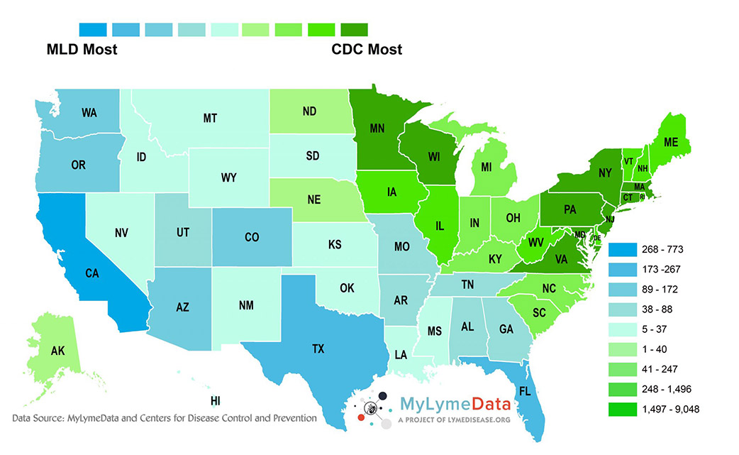
When we launched MyLymeData, we decided to compare the number of cases reported by the CDC with the number of cases enrolled in MyLymeData state-by-state. In states that are not considered by the CDC to be endemic, the number of cases in MyLymeData surpasses those reported by the CDC.
 On the map shown, the states in blue have a higher number of people enrolled in MyLymeData than are included in total CDC case reports. (In green states, the CDC has more cases.) The differences reflected on the map suggest a broad pattern of underreporting by the CDC of Lyme disease in the South and the West.
There are some important differences in the MyLymeData and the CDC statistics. MyLymeData collects information from participants regardless of when they were infected, while the CDC reports are for the year 2015. However, the MyLymeData cases included in the data collected by that time was 5,776—a far smaller sample size than the CDC’s (38,069). This means that the MyLymeData sample is about one-seventh of the cases reported annually by the CDC. Ordinarily, CDC cases should surpass MyLymeData cases across the board in every state just because their sample is so much larger………. Join or login below to continue reading.


